
Colour
Colour pairing rules for outfits
Most outfits that look good share a few structural choices: how light or dark each piece is, how warm or cool, how saturated, and how many colours are in play. This guide turns those choices into rules of thumb you can apply in front of your wardrobe.
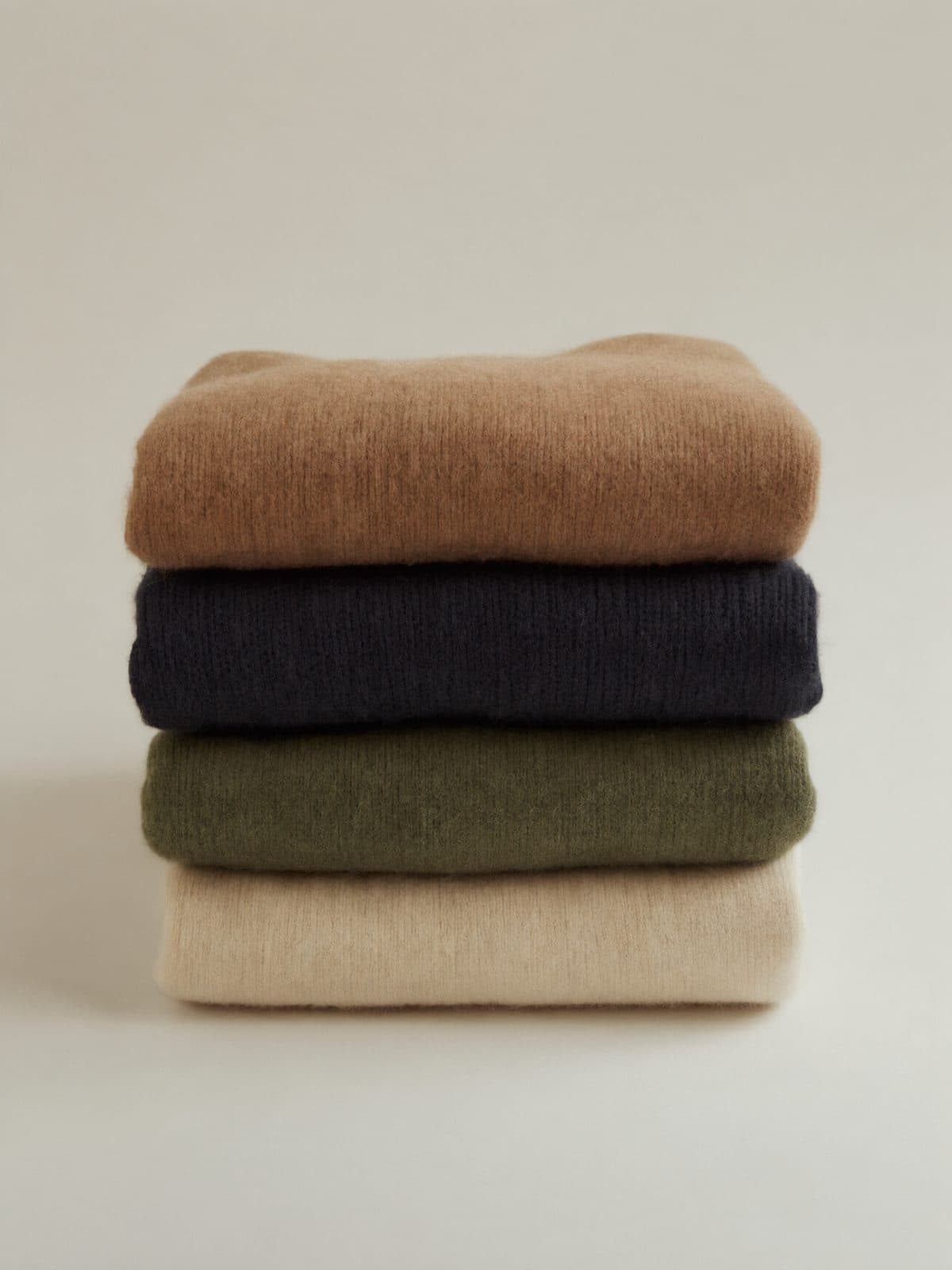
What are the neutral colours, and how do you combine them?
Neutrals are the colours that go with almost everything: black, white, grey, navy, cream, beige, camel, brown and, in practice, olive and khaki. They sit low in saturation, so they rarely clash. A good outfit can be made entirely from them, as long as there is variation in lightness and texture.
Most neutrals lean warm or cool. Black, white, grey and navy are cool; cream, beige, camel and brown are warm. Mixing the two families works well when the shades are separated clearly: navy with camel is a classic, as is grey with cream. It looks muddy only when they are close in value, as with a mid-grey and a mid-beige side by side.
The simplest way to build with neutrals is to choose a dark, a light and a mid-tone, for example navy trousers, a cream sweater and a camel coat. Each has its own job, and no two are fighting for attention.
What is value contrast, and why does it matter more than hue?
Value is how light or dark a colour is, regardless of its hue. It is the most powerful tool in dressing because it controls where the eye goes. High contrast between top and bottom, like a white shirt and navy trousers, makes the waist the focal point. Low contrast, like a mid-grey sweater and charcoal trousers, creates a long, smooth line.
A quick way to check: take a photo of the outfit and look at it in black and white. If everything turns into one grey block, there is no value contrast, and the outfit may look flat even if the colours are interesting. If the lights and darks are distributed with some thought, the outfit holds together in any colour.
Value also helps solve the problem of colours that seem to clash. Two mid-bright colours of similar lightness, such as a mid-green and a mid-pink, often fight. Change one to a deeper or paler version and the clash goes away.
How does tonal dressing work?
Tonal dressing means wearing different shades of one colour, such as cream, oatmeal and camel, or navy, denim and pale blue. It looks expensive because it removes visual noise and lets texture do the work. A cream cable-knit, ecru trousers and a sand-coloured coat have the same hue but different fabrics, and the surfaces catch the light differently.
The key is to vary both lightness and texture. If every piece is the same shade and the same material, the effect is flat and uniform. Aim for at least two steps in value, and mix a matt fabric, such as wool or cotton, with something that has a different surface: suede, silk, leather.
Tonal outfits also give you a free pass on accessories. A bag or boot in a deeper shade of the same family adds depth without adding a new colour.
How do warm and cool colours work together?
Colours have a temperature. Reds, oranges, yellows and warm browns are warm; blues, greens with a blue base, purples and greys are cool. Wearing a mostly warm or mostly cool palette feels harmonious because the colours share an undertone. Camel, rust, cream and olive are one such family; navy, grey, white and black are another.
Combining the two creates tension, which can be good. The classic example is complementary colours, which sit opposite each other on the colour wheel: blue and orange, red and green, yellow and purple. In full strength they are loud, so in clothing they work best when one of them is muted or dark. Navy and rust, burgundy and forest green, and lavender and mustard are far easier to wear than royal blue and bright orange.
Analogous colours, which sit next to each other on the wheel, are the calm option: blue with green, orange with red, yellow with olive. They need less planning because they share a base, and they pair well with a neutral in the middle.
How do you use one accent colour, and what about patterns?
A useful rule of thumb is the 60-30-10 split: about sixty per cent of the outfit in a dominant neutral, thirty in a secondary one, and ten in an accent. It is a heuristic, not a measurement, but it keeps outfits from becoming busy. The accent can be anything: a bag, a scarf, a shirt, a pair of socks. Repeat it once somewhere else in the outfit so it looks planned.
For patterns, treat the dominant colour in the pattern as one of your colours. A check blazer with grey and brown can be matched with grey and brown. Mixing patterns is easier when they differ in scale, such as a wide stripe with a fine check, and when they share at least one colour.
Colour near your face deserves a thought. A shade that brightens your skin and hair will look better in a top or scarf than one that dulls them. This is personal, not a rule about bodies or complexions, and the best test is a mirror in daylight. If a colour feels wrong near your face, wear it lower down.
One piece, three looks
The same piece, styled for three different moments.
I Weekend
Tonal warmth
- cream cotton T-shirt, visible at the neckline
- ecru cotton straight-leg trousers
- tan suede ankle boots
- camel wool scarf
- brown leather belt
With a rust knit as the deepest warm tone, the cream and ecru give it room to breathe. Everything shares a warm undertone, and the suede and wool add texture.
II Office
Complementary calm
- white cotton poplin shirt, collar worn over the knit
- navy wool trousers, straight leg
- dark brown leather loafers
- navy wool overcoat
- dark brown leather belt
Worn with a rust knit on top, navy sets up a complementary pair: blue and orange are opposites on the colour wheel, and a dark, muted navy keeps it quiet. White between them separates the two and lifts the whole outfit.
III Evening
Neutral anchor
- charcoal wool trousers
- black leather Chelsea boots
- black wool coat
- grey merino scarf
- black leather gloves
Charcoal and black give a cool, dark base so the rust knit is the one warm accent. The 60-30-10 idea in practice: a mostly dark outfit with one colour that is clearly the point.
Common mistakes
- Combining several mid-bright colours of the same lightness leads to clashes; make one of them much darker or paler, or turn the rest into neutrals.
- Matching everything exactly makes an outfit look flat; vary the shade by at least two steps and mix textures.
- Placing two near-identical neutrals side by side, such as black and very dark navy, can look like a mistake; either go clearly different or match them properly.
- Using three or more strong colours without a plan leaves the eye nowhere to rest; choose one accent and make the rest neutral.
- Treating colour advice as a rule about your body is a mistake; use it as a way to test what you like in the mirror, and wear what makes you feel good.
Questions people ask
What colours go with everything?
Black, white, grey, navy, cream and camel are the usual answers, because they are low in saturation and sit comfortably next to almost any other colour. Olive and brown are close behind. Variation in lightness and texture matters more than the exact choice.
Can you wear black and navy together?
Yes. The two are close in value, so the effect is subtle and quiet. It works best if one of them is clearly lighter or the fabrics differ, for example a black leather bag with a navy wool coat. Check in daylight, since it is harder to tell them apart indoors.
How many colours should an outfit have?
A good starting point is two or three, counting neutrals as one family. One accent colour is usually enough. Patterns count as extra colours, so keep to the shades already in the pattern.
What colour goes with olive green?
Cream, navy, rust, camel and brown. Olive is a muted, warm green, so it sits well with other earthy colours and with cool neutrals that give contrast, such as navy or charcoal. Pink and burgundy also work if they are muted.
Do I need to know my colour season?
No. Colour analysis can be a useful way of exploring, but the structure of an outfit, meaning the contrast, the number of colours and the repetition, matters more than any season. If you want to explore with your own wardrobe, you can photograph a piece in 3style and see three complete outfits around it.